
Color is Complex
by Sarah Izzo
It defines our world, yet it is our own perception
Understanding Color
It might seem like a political statement, but this is not that article—color is just a combination of biological science and psychological perception. It is the brain’s translation of light hitting our eyes and how it makes us feel, an oversimplification to be sure but true all the same.
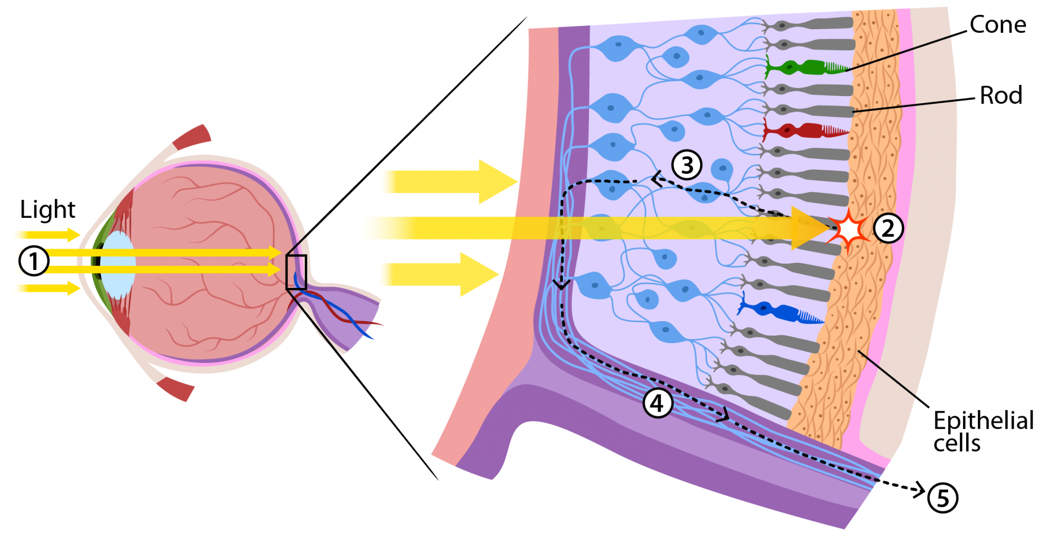
From a biological standpoint, every creature perceives light as color with specific cells in our eyes called rods and cones. The number of these vary by species and even from animal-to-animal within the same species group. Studies have found that human women, on average, have more of these cells than men. When you have more of these cells it allows you to pick up on subtle differences in shade and tone.

From a psychological perspective, culture and community play a role in creating and linking emotions to colors through experience. Yellow in one country might speak friendship, happiness and in another be used to represent sickness or distaste. Red might be a wedding color in one part of the world while in another white is more appropriate choice for the bride.
This is what makes color so complex. People do not have the same perception of color from either a biological difference or a cultural one. Your idea of grass green might not look the same to me or even be the same grass, but who is to know when it is all in our own head, eyes and hearts? That is the key—know your audience and speak to them. Color defines our world because it is how we see things both physically and emotionally, subconsciously colors speak to each of us differently. Going beyond cultural representations, simply put, color talks in feelings. Red can be used for love, passion or caution. Also, different shades or tones of any color will shift that subliminal message, navy blue can speak reliability and security while cloudy blue conveys sadness.
Systems of Color Matching
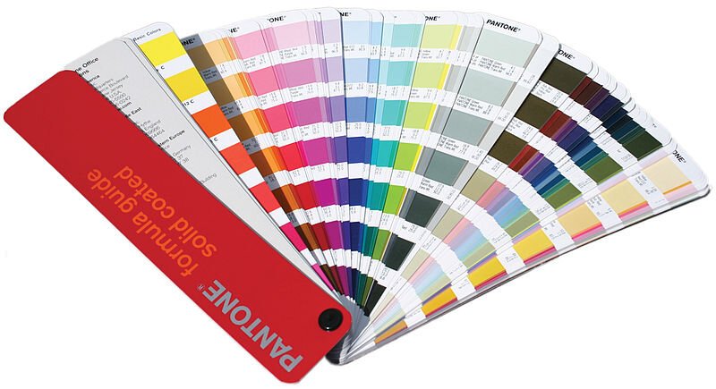
Depending upon your output, different matching systems are used to regulate consistency within those industry. Ever looked for paint and stood before the wall of color swatch cards? That is a matching system and it is not the same one that is used in printing. The leader in the print industry is Pantone and is often referred to as the Pantone Matching System (PMS).

Pantone has different color books for the different color spaces and final outputs. The one for lithography printing is separate from the one to select custom colored plastic or fabric. Remember color is light so materials, and even finishes, do not absorb and reflect light the same way. Also, the color of the material will also affect the color you apply to it. If you print bright blue on white, it’s going to look bright blue. If you print the same bright blue on green paper, it is not going to look bright blue anymore.
Equipment also plays a factor in color consistency especially when it comes to full color print production. The most common and affordable full color printing will be pleasing color. Pleasing color matching means that there will be slight variation between the pieces and the system but that it will come out in general matching range. Commercial color accuracy is more common in large volume productions. This is achieved through a combination of higher-end color accurate equipment as well as running within a regulated process to constantly measure and consistently maintain accurate color values—it also costs more hence why it is typically reserved for large volume.
Color Modes

CMYK vs. RGB: Color space is one of the most often misunderstood terms. The full color offset printing process prints color in the Cyan (Blue), Magenta (Pink), Yellow and Black (CMYK). Computer monitors display the colors in the Red, Green and Blue (RGB). What can be achieved on a monitor made of light is not always possible on materials that do not have their own light source. Hence, RGB when converted to CMYK will often look desaturated or dull as a lot of the light gets lost in the conversion. Therefore, printers will frequently tell you that you cannot approve color on a monitor—like eyes, monitors vary.
CMYK vs. SPOT: There are two types of print production color systems—CMYK also called full color process or SPOT sometimes called solid. CMYK is a full color printing process that uses those four colors previously mentioned to produce all colors in the printed piece. Solid spot pantones are a single specific high pigment color that can be used alone or in combination with other ink colors to produce a job in specific colors or to reduce cost. They can also be added to CMYK production making it a CMYK plus SPOT production—or five colors. There really is no limit other than your budget.
Rich Black: In 4 color process printing large areas of black can appear thin or washed out due to only one layer of ink being put down. To compensate for this ‘rich black’ should be used for large black solids. OEX specifies a formula of 40% cyan, 40% magenta, 40% yellow and 100% black to produce a neutral rich black.
Black Text: Type is another matter. To assure clean appearing black text, type less than 36 points high should be created as black only (100% k) with no other color mixed in. Even for typefaces over 36 points rich black should only be used where the face is bold or blocky. Type to print in colors other than black does not have any special requirements.
Color Made Simple

There are many more in-depth articles on the science and psychology of color. There are endless factors and variables within all the different materials and productions. The selection of color isn’t as simple as picking one color that will look the same in all mediums. You cannot expect one color mix to work for the paint on your walls, the plastic in your building sign, the fabric of your chairs, the imprint on your mug, the embroidery on your shirts, the printed logo on your business card and how it all matches your website. It is a careful process of considering the material, the finish and production you are working within.
The designers at OEX have experience and expertise in all these areas to be a knowledgeable advocate for our clients. We assist to identify and understand the specific audience to make color suggestions that work with the brand and communicate the message. We guide our clients through each of the different productions to make sure they’re making the best choice for their brand and budget. We design with color in mind. We are here whenever you’re ready to start the conversation—let OEX join your team.